Redesigning an existing compliance platform to make it more intuitive, consistent, and ready to scale.

Problem
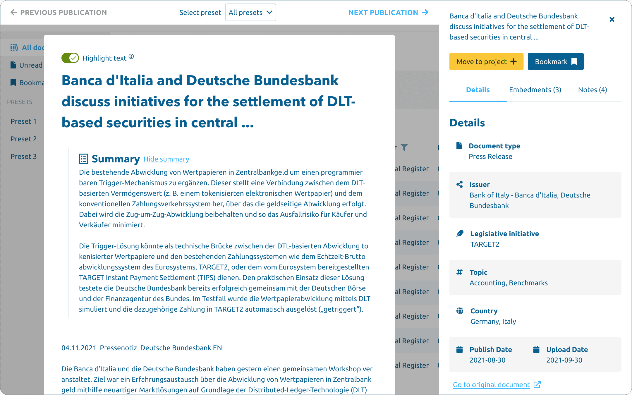
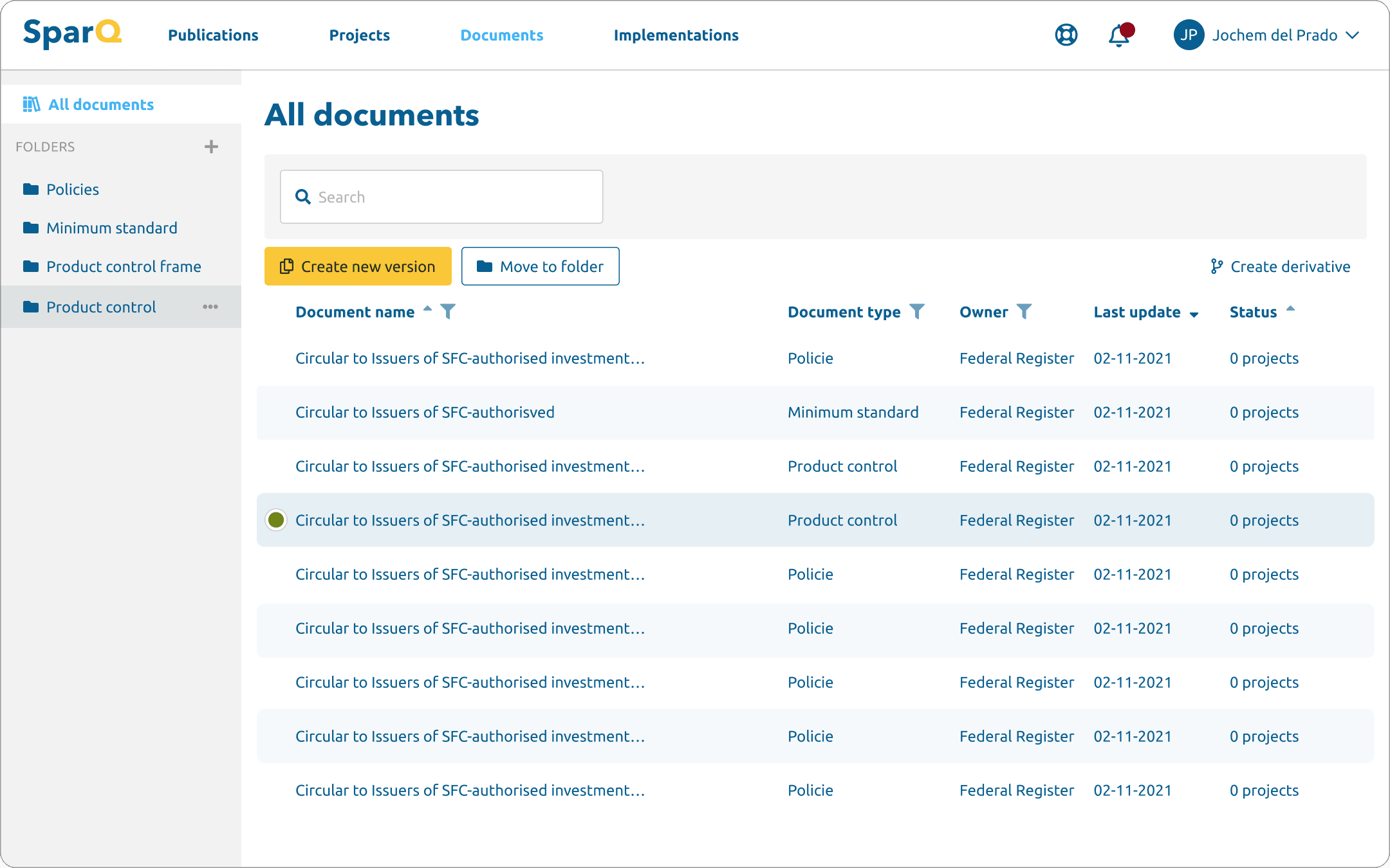
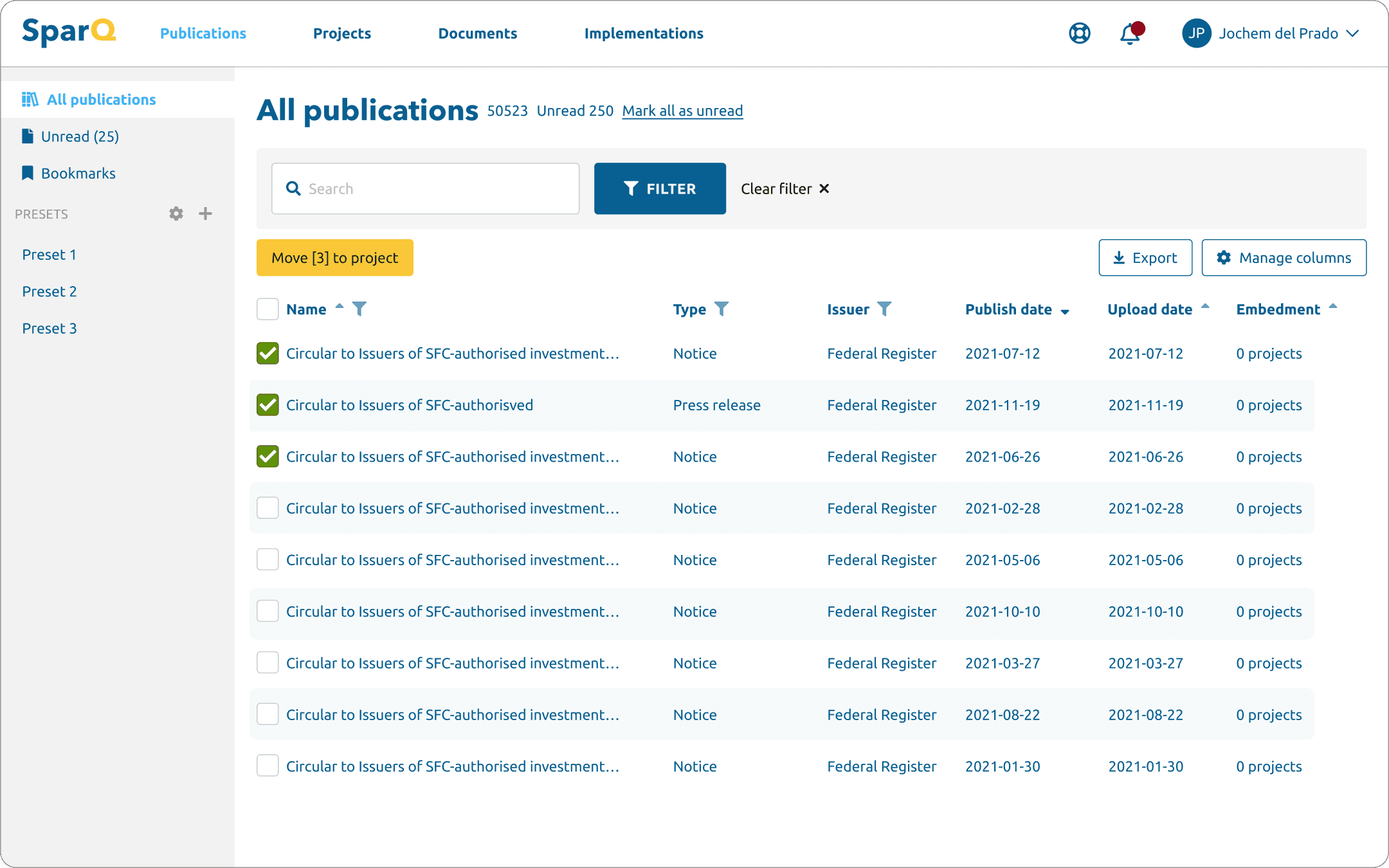
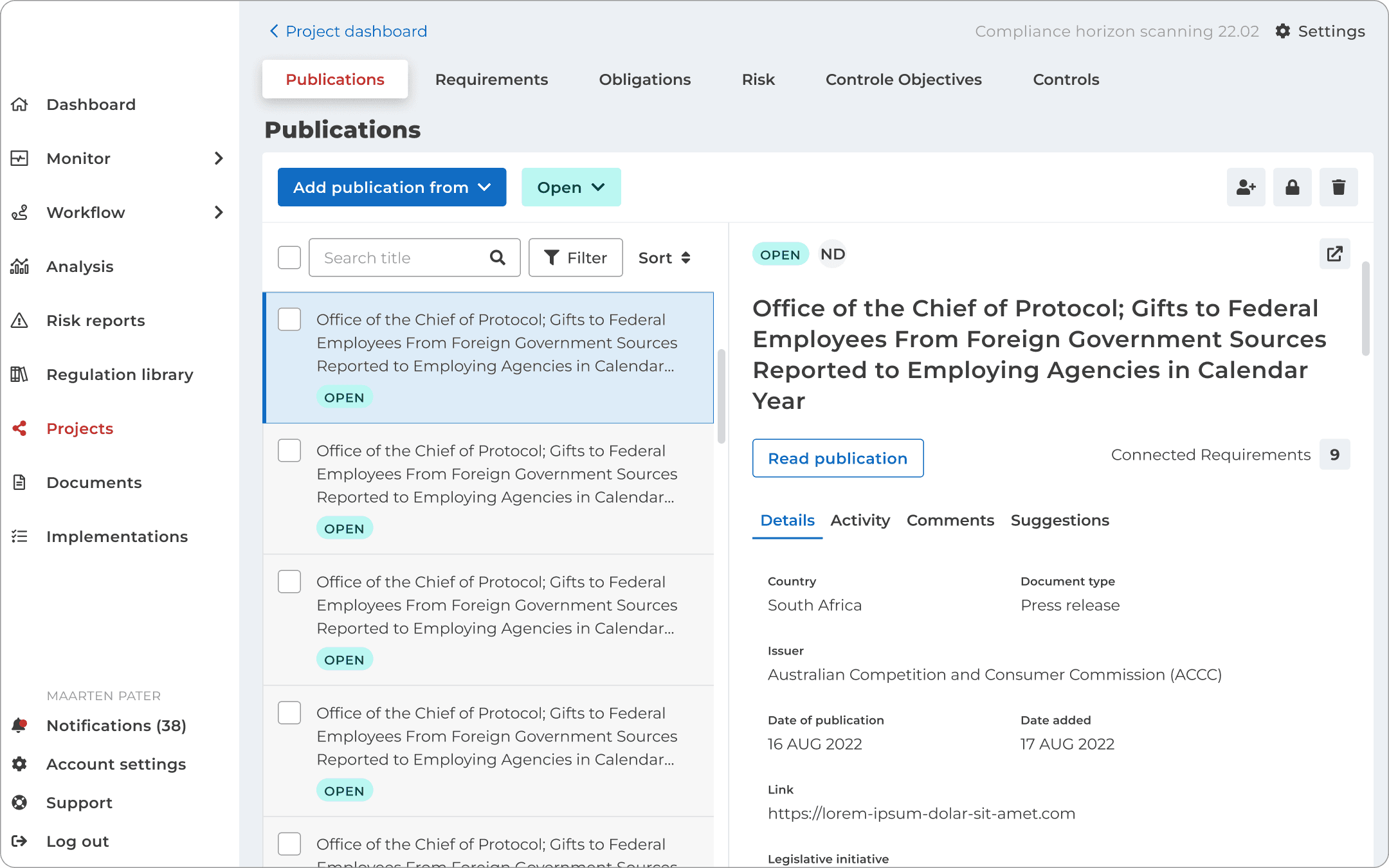
Sparq was already live — an end-to-end web application helping ING implement external regulations more efficiently.
The team believed the platform was well-received — and for experienced users, it was. But as Sparq grew and onboarded new users, a different picture emerged.
The UI had become visually outdated, the existing design system needed an overhaul, and new features had introduced inconsistencies that made different parts of the platform feel disconnected.
Two parallel tracks
Halfway through the redesign, the scope expanded.
Rather than focusing on the redesign alone, I started working on two tracks simultaneously: continuing the long-term redesign while also optimising the current live platform.
The team held weekly sessions with users where I presented demos of new flows and collected feedback in real time. It was during this optimisation phase that my colleague and I pushed for usability testing with new users — separate from the power users the team typically gathered feedback from. The results were clear: experienced users had learned to work around the interface, but new users were completely lost.
Process:
1. Wireframe
2. UI design
3. Prototype
4. Usability test
Role:
UX design
UI design
Prototyping
Research
Tools:
Figma
Year:
2022
Personal stuff I learned
Usability test
4 users, 30-minute sessions. Focus areas: project dashboard, allocating, tasks, and archiving. 14 out of 25 tasks failed outright — the user either did the wrong thing or took well over 30 seconds to find a solution.
"I honestly cannot find it"
Key findings:
Allocating , action unclear Users confused "allocating" with "assigning" and clicked the status field instead. Even when they eventually allocated, confirmation feedback was too subtle to notice.
Allocating = task, connection invisible None of the users understood that allocating a colleague automatically creates a task. They expected a notification and couldn't find where tasks were stored.
Completing a task, no reward Users unchecked the checkbox after completing a task because the UI gave no satisfying confirmation. The link between allocation and the resulting task was too weak throughout.
Archiving, wrong mental model Most users looked for the archive option on the home page. It was hidden inside the project settings gear icon — not where anyone expected it.
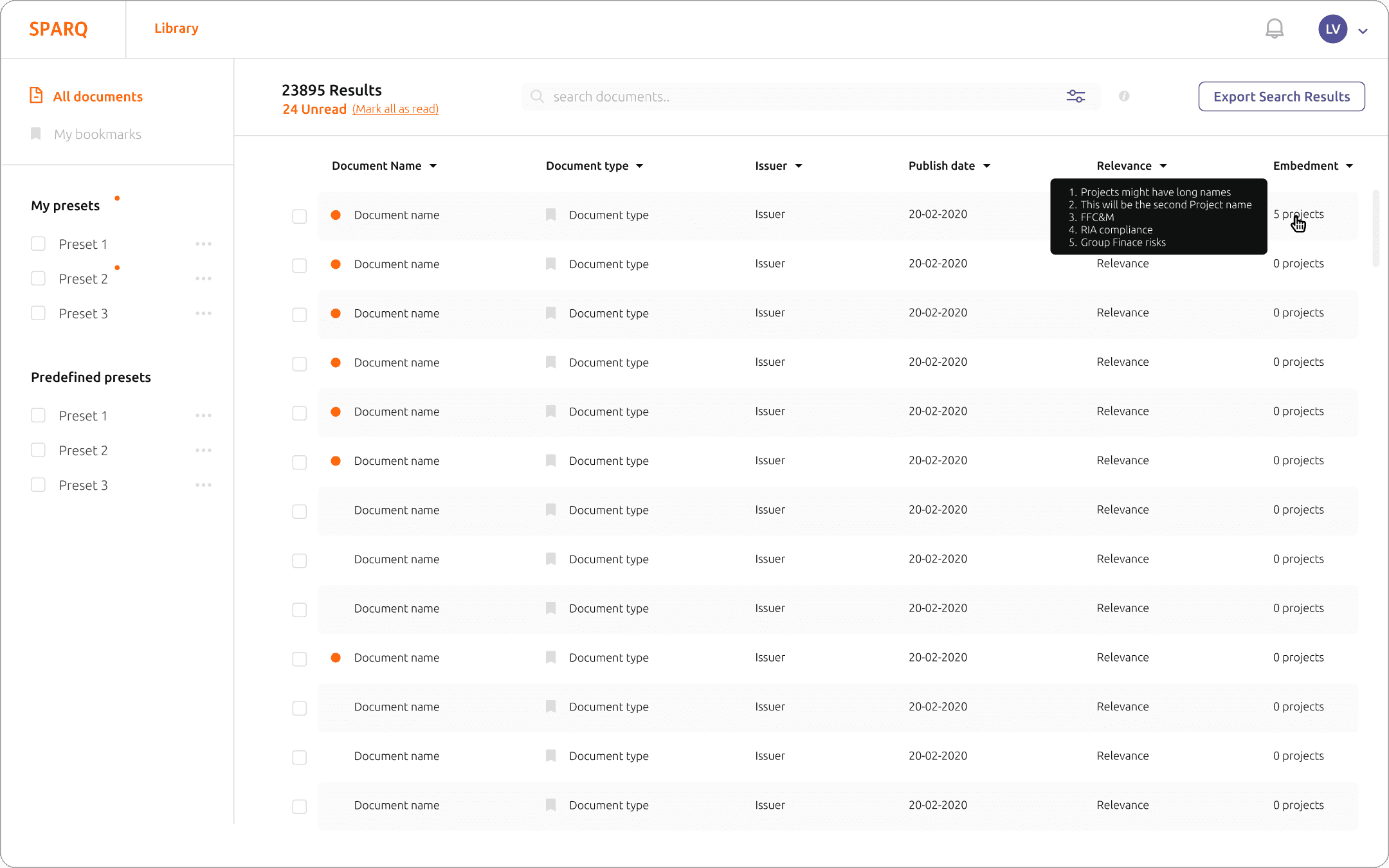
Dashboard colours, hover required The pie chart statuses only revealed their meaning on hover. Orange was consistently misread. Users needed a visible legend to interpret the dashboard at a glance.
Project dashboard navigation, unclear Users couldn't find their way back to the project dashboard and ended up on the home page instead. The top navigation needed a clearer structure.
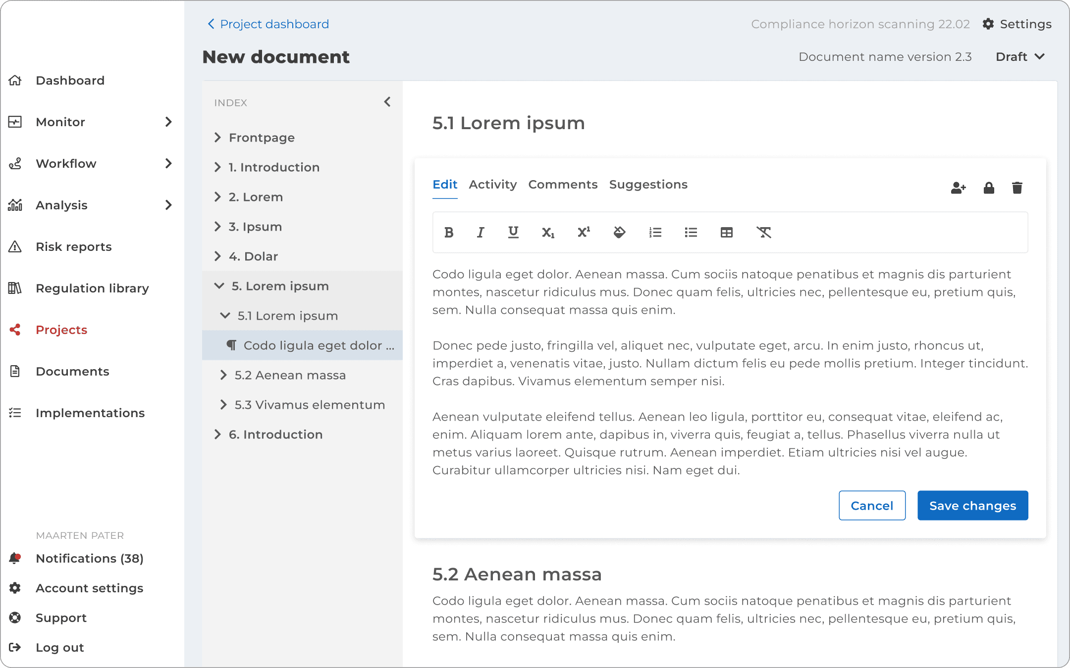
UI design
More work